
I joined Cartesia as their founding designer — directing, building, and growing the self-serve experience for our AI models and voice agents product from zero to one.
Designing Cartesia’s flagship text-to-speech playground
Cartesia's text-to-speech playground is largely our users' first impression of our technology. It was important for the experience to be charming, seamless, and memorably capable. It was also an interface that needed to flex to tailor to a variety of audiences, from CEOs to indie developers to non-technical members exploring voice solutions for their team.
It was the exact moment to convince users "Cartesia is for me".

Pain points
There were 3 main pain points I wanted to address through a redesign.
1. Voice selection required 2-3 clicks, adding friction to one of the most fun and engaging aspects to a text-to-speech generation.
This came from a key insight that with a text-to-speech model, it was equally about selling a model as it was about selling a voice. The result of a model is precisely dependent on the voice. The worldview around models is in a way agnostic, customers don’t buy a model without a voice that works for them first.
Previously, we reserved the functionality of voice search and discovery to the Voice Library feature. However, user testing validated this insight: the text-to-speech playground feature is used to test the models, just as much as it is to test and discover voices.
Users changed out voices more often than they edited the transcript, as they were more likely to come to the playground already knowing what they wanted to transcribe. This was true amongst hobbyists, as well as companies with a use case transcript they were already testing and comparing against other model providers.
2. The history section scrolled infinitely, resulting in confusing moments where the text-to-speech module was not available on the page.
In addition to increasing cognitive load by requesting users to "switch" between either a text-to-speech or history view, this design also didn't consider how users used the history feature. Historical generations were often used to compare the same transcript with changes to voices or configurations, and then brought back into the text-to-speech generation space to re-generate with a new setting. The infinite scroll made it difficult to retain a "sense of place" between the history and active generation. How might different a different interface pattern improve the design of the history feature so that both the primary text-to-speech generation space and history was persistently accessible?
3. I received internal feedback that the configurations "felt like they were floating". The configurations inside a card didn't visually align with the rest of the platform. Additionally, the organization and grouping of configurations didn't align with intended hierarchy and the user journey of selecting/editing them.
Approach
I designed a new text-to-speech page addressing these pain points.
This approach was driven by a new visual hierarchy that aligned with the insight that voice selection was key to model adoption. Additionally, remaining configurations rarely customized. For example, even though the model selection was vital to the output, it was rarely switched to anything other than the most recent model.
This feature also hones a visual refresh, shipped alongside a larger design systems initiative.
This design was also successful in regrouping features in a modular way. For example, configurations now lived in a scalable panel, adaptable to any new configuration types our research team may introduce in the future.
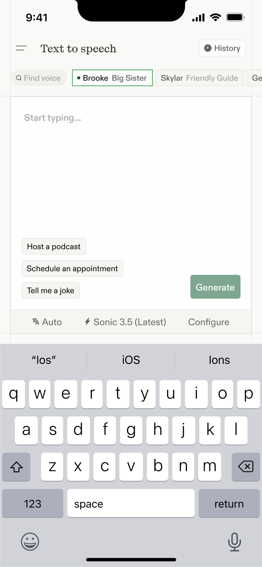
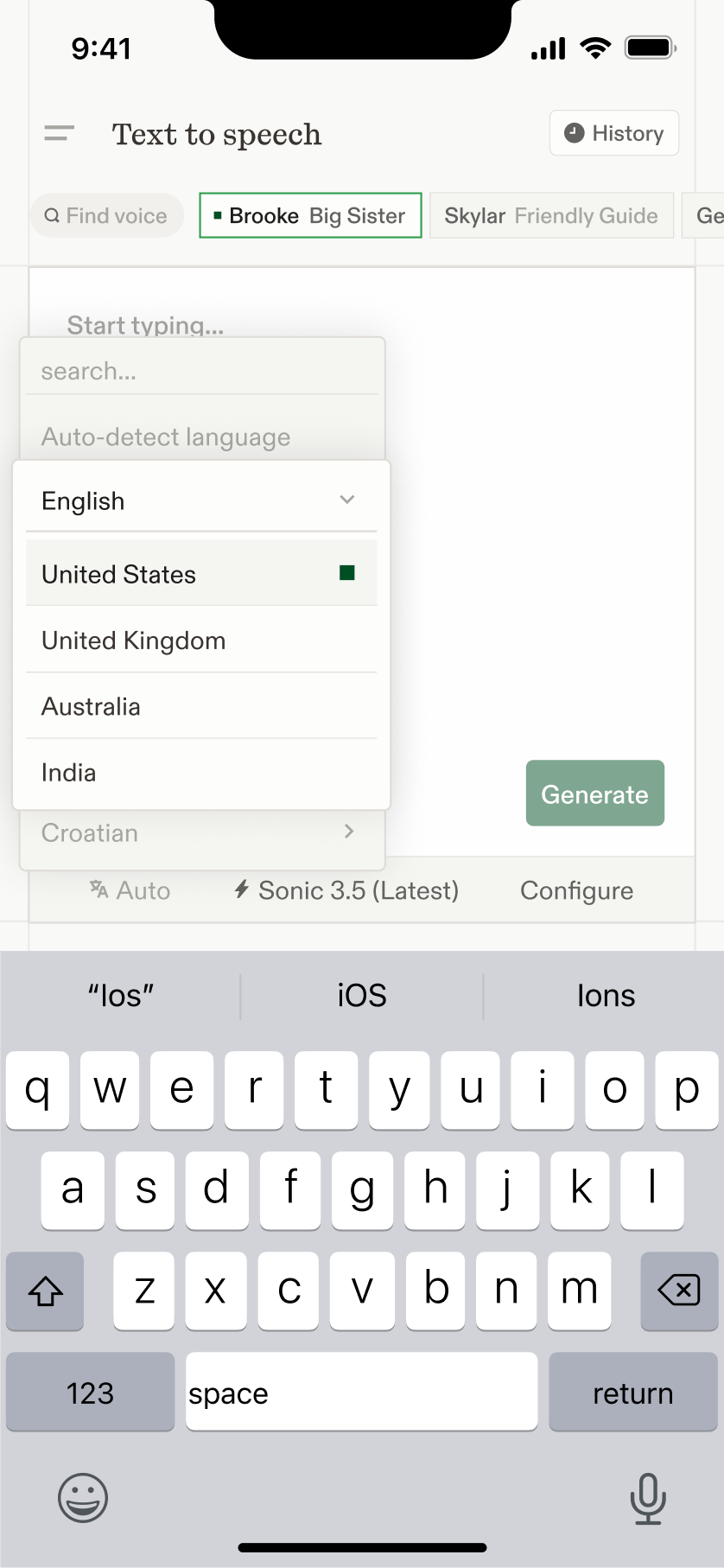
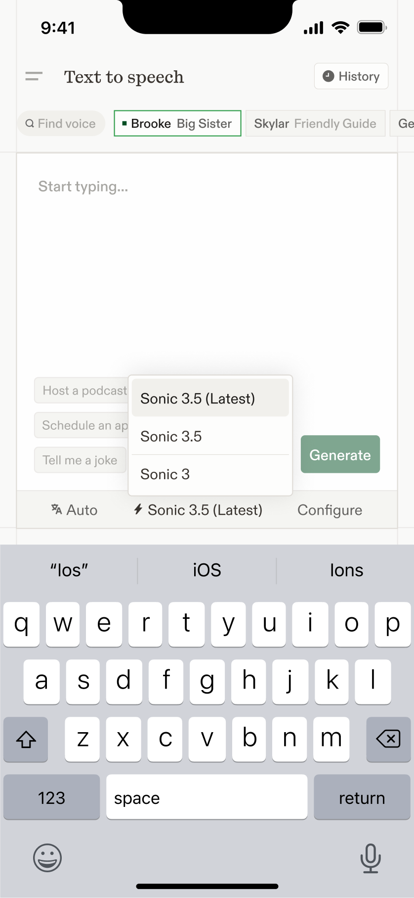
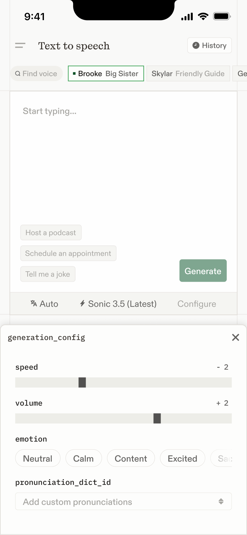
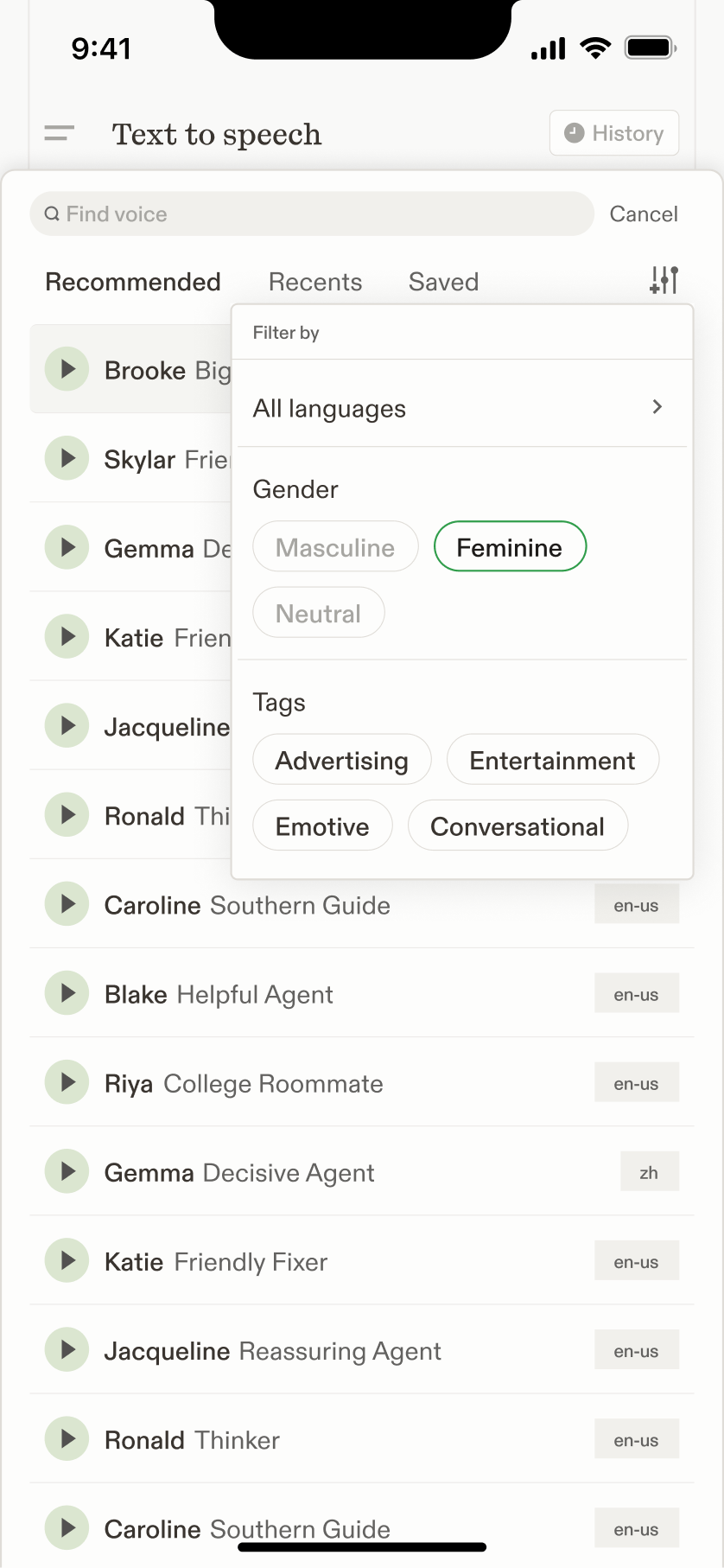
The hierarchy also afforded a creative mobile adaptation, reflecting the user flow of voice selection and transcript being primary, with remaining configurations secondary.
Design system
Cartesia’s prior brand design was pulled together a few different prior brand initiatives into one. It was fast and scrappy; we were fast and scrappy.
Without a single outlined identity, there were inconsistencies between different surfaces, such as marketing and product.
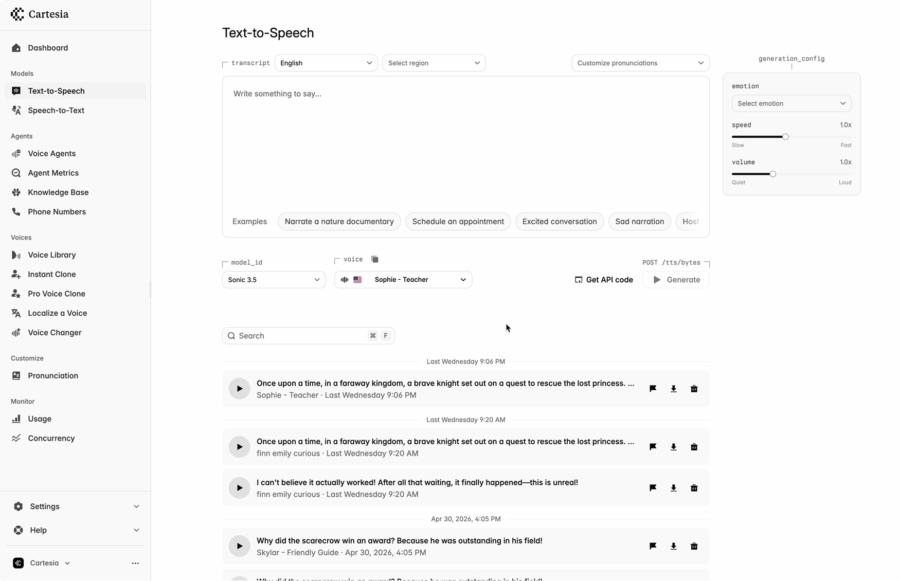
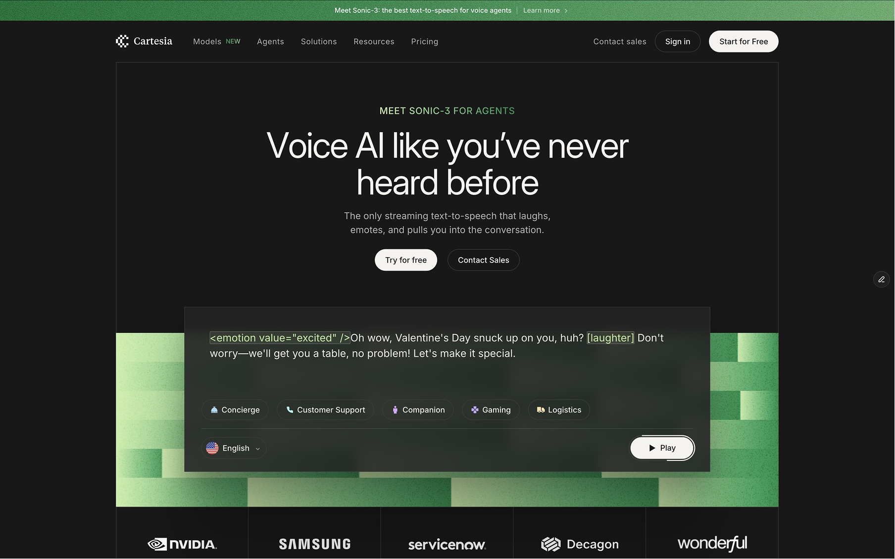
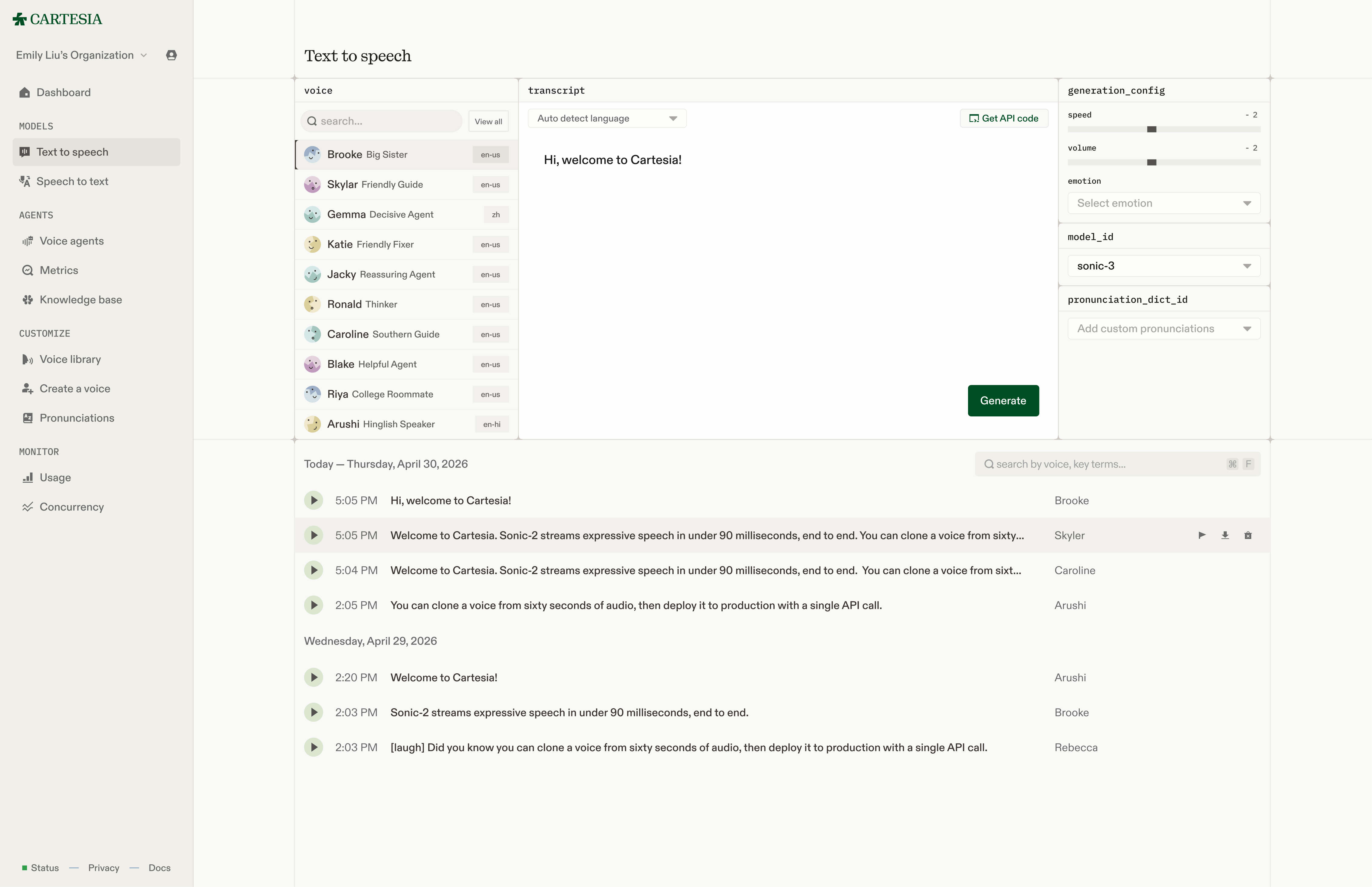
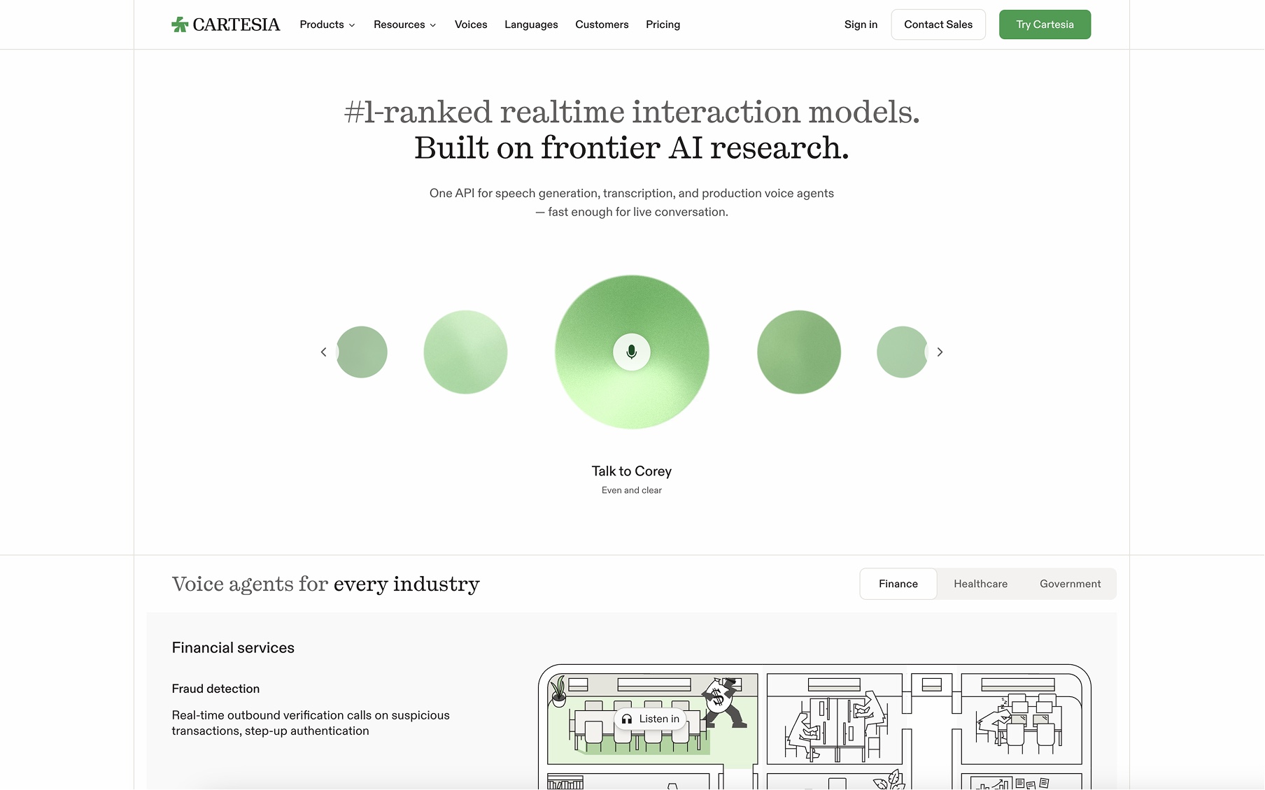
Before and After
Most importantly, the old brand didn’t tell a story. There was no clear motivation in the creative direction, making it difficult to meaningfully extend.
Therefore, we invested in a rebrand to debut a more matured and focused identity and stance in the frontier research and product space.
This visual rebrand simultaneously posed opportunities to:
Brand conviction: The new brand we landed on was more humanist, academic, and playful — representing our company’s history, mission, and values.
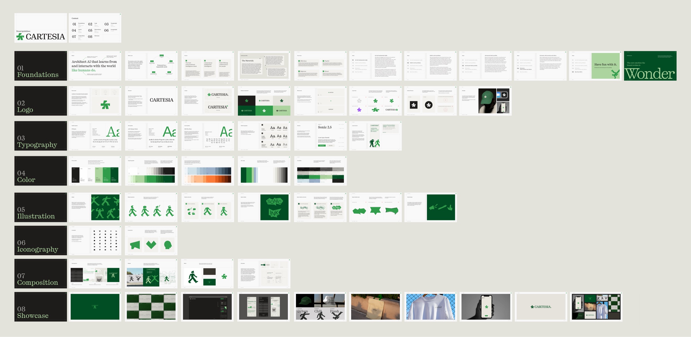
Brand book
At the core of the rebrand was the introduction of a new little guy, Archie. He takes form of the personification of an asterisk, a symbol that says “there’s more here, dig deeper”. He embodies an invitation to be curious, that there is something worth knowing living beneath the surface.

Introducing Archie. Be nice to him.
What’s most unique about Archie is his sense of play and mischief. This opened many creative doors to extend into the product design.
Deconstructing
I began by deconstructing the brand into language — providing metaphors that can be tastefully applied to the interface design through color, form, and motion. This language represents the story users should feel when using our product.
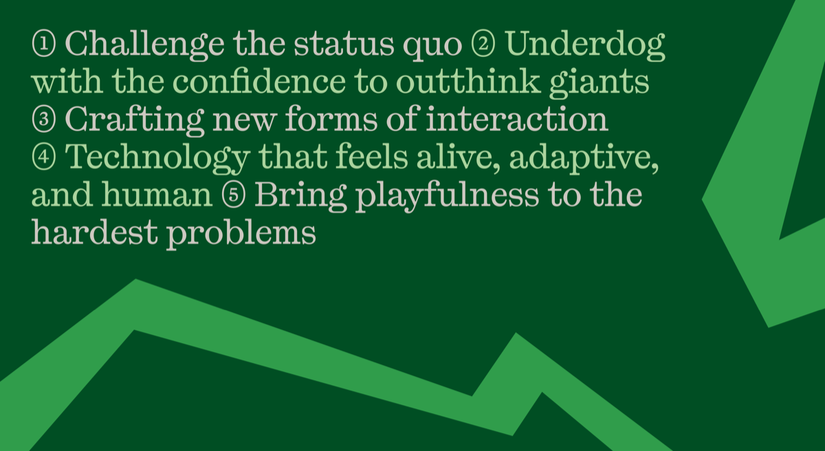
The Cartesia playground’s job is to serve a highly identifiable, memorable, and technically capable first impression of our technology.
Reconstructing: From brand guidelines to design system
This story was reconstructed into a grounded and precise design system.
Colors: A palette was pulled from elements of the natural world — lush greens, sky blues, sands, and earth. It represents finding a reliable source of confidence from working on the fundamentals.
Colors are implemented in a 3-tier system, allowing more flexibility and coordination cross-functionally between product and marketing, and digital and print.
Brand
Used for buttons, accents, and pop of brand
Memory
#99B0C8
oklch(0.7477 0.0431 249.52)
Mist
#D1E2E8
oklch(0.9019 0.02 220.88)
primary-alt
Verdant
#309D4B
oklch(0.6157 0.1545 147.96)
brand
Growth
#DBE5D0
oklch(0.9086 0.03 127.9)
brand-accent
Growth-150
#CBD6C1
oklch(0.8619 0.0308 129.78)
primary
Forest
#004E23
oklch(0.371 0.0989 151.4)
primary-accent
Forest-50
#255F38
oklch(0.436 0.0884 151.71)
Border
Used for borders, separators, and nibs
border
Bone-200
#DFDCD7
oklch(0.8954 0.0075 80.72)
border-light
Bone-100
#FDFDFC
oklch(0.938 0.0035 67.78)
border-flourish
Bone-300
#CDC8C1
oklch(0.8348 0.0111 76.59)
Surfaces
Used for fills
popover
card
Canvas-100
#FDFDFC
oklch(0.9938 0.0013 106.42)
primary-foreground
background-content
Canvas-50
#FEFEFE
oklch(0.997 0 0)
background
secondary
Canvas-150
#F9F9F8
oklch(0.9818 0.0013 106.42)
muted-1
Canvas-200
#F5F5F2
oklch(0.9693 0.004 106.47)
accent
Canvas-300
#F3F2EF
oklch(0.9611 0.0041 91.45)
muted-2
Canvas-400
#F1F0EC
oklch(0.9548 0.0054 95.1)
muted-3
Canvas-500
#EDEDE8
oklch(0.9447 0.0067 106.53)
sidebar
Sand-200
#F0EFE9
oklch(0.9512 0.008 98.88)
sidebar-accent
Sand-300
#EAE9E2
oklch(0.9329 0.0094 99.99)
muted-4
sidebar-primary
Sand-400
#E4E3DB
oklch(0.9144 0.0108 100.83)
Foreground
Used for text and icons
foreground-primary
Carbon-900
#1E1C1A
oklch(0.2279 0.0049 67.58)
accent-foreground
sidebar-accent-foreground
Carbon-700
#39342F
oklch(0.3285 0.0112 67.42)
sidebar-primary-foreground
brand-accent-foreground
secondary-accent-foreground
Carbon-500
#525150
oklch(0.4355 0.0021 67.77)
foreground-secondary
Carbon-400
#636260
oklch(0.4964 0.0034 84.57)
sidebar-foreground
secondary-foreground
brand-foreground
Carbon-300
#696969
oklch(0.5208 0 0)
foreground-tertiary
Carbon-100
#A7A6A2
oklch(0.7248 0.0058 95.13)
The palette is sorted into Brand, Border, Surfaces, and Foreground, which offers suggestions when in search for colors. You’ll notice that some colors (Memory and Mist) aren’t assigned any component token because, while part of the brand identity, they haven’t found a place in the product [yet!]. Other colors have multiple component tokens — breaking out of the “category” they are in — which proves the merit of using a multi-tiered system!
Component tokens are named semantically, by their role followed by their relationship to the component. When a token represents a component’s primary role, the role comes first. For example, secondary defines the background of a secondary color, and pairs with secondary-foreground which defines the icon/text color in that button. When a token describes a property applied within a broader context, the property comes first. For example, foreground-secondary is used for as a “secondary” foreground across background surfaces.
0:04 / 0:11
Player component using brand, brand-accent, brand-foreground, and brand-accent-foreground
Form and Motion
Iconography was an opportunity for unobtrusive delight, bringing playfulness while maintaining craft. We wanted to use forms that evoked resemblance to science/spacecraft/boardgames/riddles. Geek is so back.
speed
Dashboard
Announcement
Deployed
Status
Try playing around :-)
Using the guidance on textures from the brand book, I designed a generative system for profiles for voices.
Meet
Skylar
Adding a final identifiable touch, I designed a system of borders and nibs inspired by webs and veins. Reserved to emphasise magical moments, such as a text-to-speech generation.
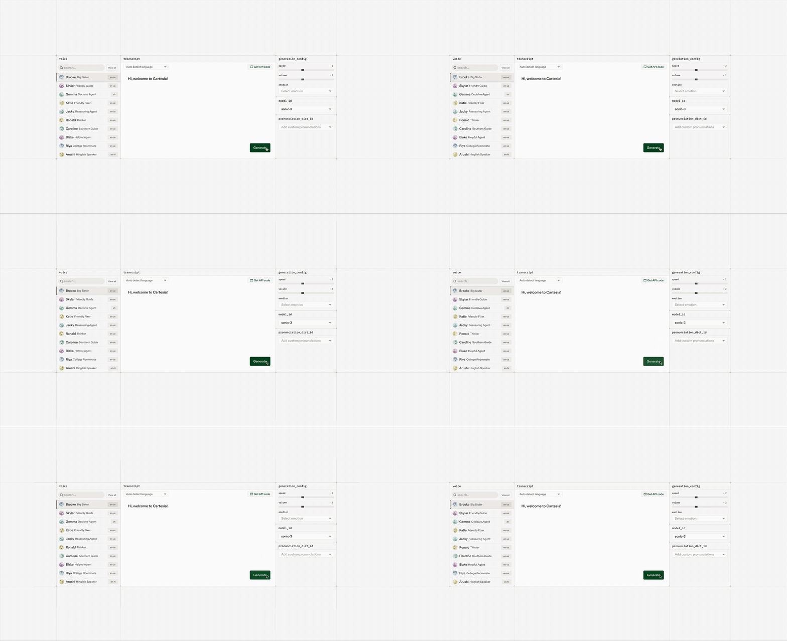
Technology that feels alive, like blood pulsing through veins.
By establishing a design system from the new brand, we achieved a cohesive look and feel cross-functionally. The initiative for a design system naturally funded refreshing our interface designs as well — providing opportunities to combat known UX pain points from a systematic lens.