New York Times — Storytelling & The Reader’s Experience
During the summer of 2023, I began a product design internship on the Storytelling team at the NYT. My work focused on the Cards (short-form story) format. The Big Questions 💡: How could journalism reach more people through a highly visually engaging, shorter, and more interactive reading experience? What are the types of stories that work best in this format, and how can different types of content be expressed through one system?
I completed projects ranging from audits to user research to the pagination redesign for the NYTimes app.
I extended my internship into the next year, and continued to work on more new story formats, story page redesign, and corresponding internal journalist tools.
Most of that work is confidential 🗝️, but if you have a password (located next to the NYT subheading on my resume), you’re welcome to view it here ︎︎︎!
I also worked on Circles, a NYT app redesign with social community-oriented features to engage younger audiences. I’m allowed to show Circles publicly, so check it out down below!
The full, final slidedeck with in detail process and the product as a whole can be viewed here︎︎︎.
Circles
a community-driven news consumption experience

Duration
30 hours
30 hours
Client
NYT
NYT
Role
Designer, researcher
(worked with design intern cohort)
Designer, researcher
(worked with design intern cohort)
Tools
Figma
Figma
Problem
Younger people are reading the NYT for their news less and less.
A survey revealed these common attributes associated with highly engaged readers at NYT: white, lives in the United States in an urban area, male, age 50+.

Process
1. Empathizing
We started with the question: “What does it mean to be a young person reading the news today?”
And reached out first key finding 🌬️: Young people primarily use social media for their news.
Our hypothesis: Today’s youth grew up surrounded by the collaborative and interactive world of Web 2.0. Thus, they have a certain expectation that their online experience is highly interactive, engaging, and centered on people and networks.
The key insight 🧩: Social media offers social clues that help people tap into the interests of their peers and indicate what content is worth their time in an internet that is an otherwise endless, overwhelming, and lonely sea of content.
2. Refining a problem space:
How might NYT engage young people seeking community in their news consumption through introducing elements of social interaction into the reading experience?
 I analyzed existing online behaviors and the creative ways people adapt to fulfill their needs. Their adaptive strategies helped identify pain points that informed gaps and opportunities for our design.
Approach
We designed Circles, a community-centered app that’s used congruently to the current NYT news app. Circles allows you to annotate articles either for yourself, or in order to start conversations within them. Your circle’s activity shows up in a feed, recommending you media based on your community’s interests (vs. echo chambers). You also have your own profile which you can personally curate, as well as opportunities to browse, join, and/or make [other] communities.
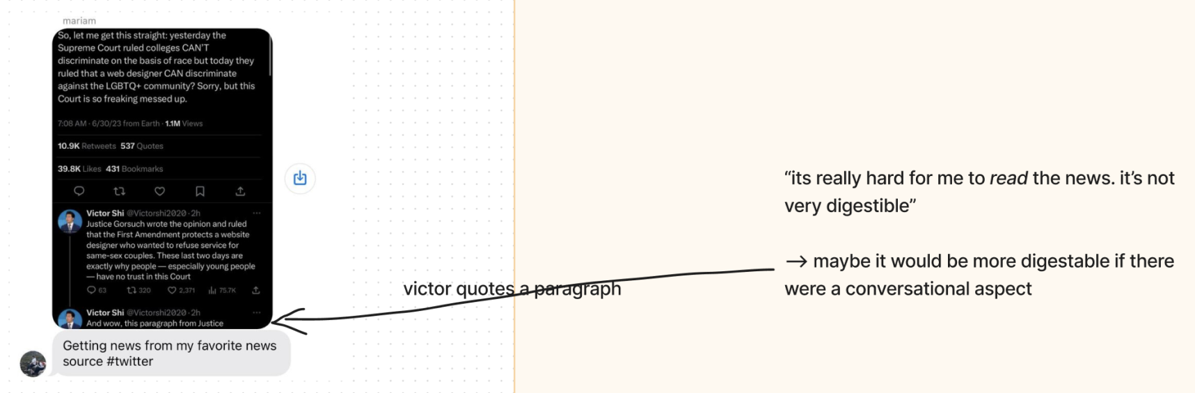
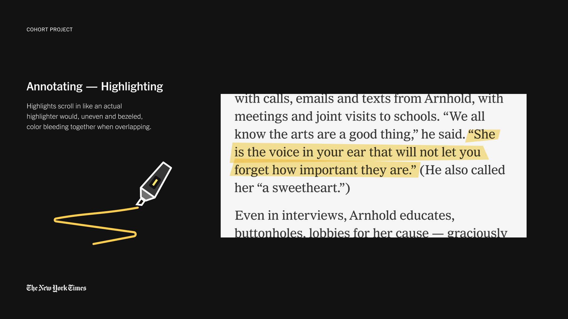
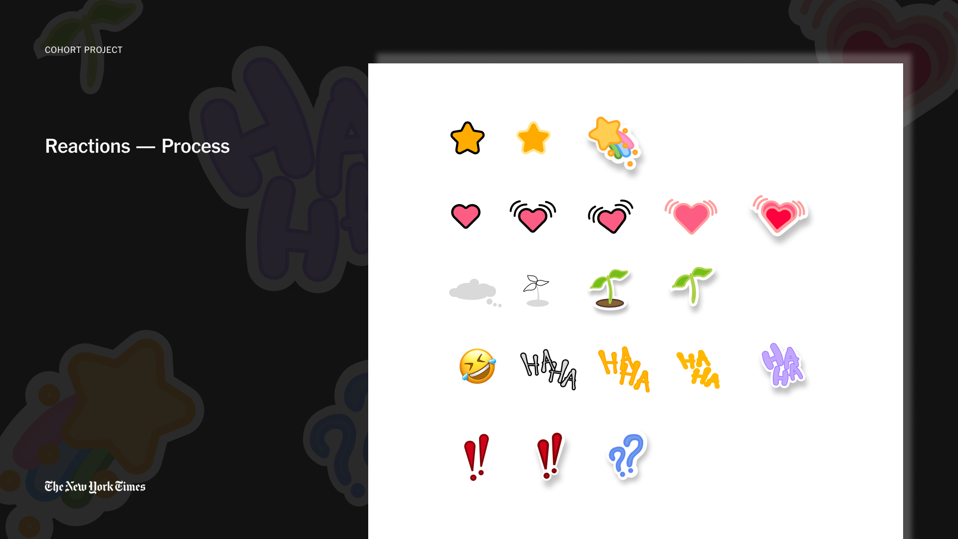
I designed the annotating tools for Circles, which allows you to select sentences of an article at a time, and comment, highlight, react, or share them.

The design dug at a fundamental user goal we uncovered, and the greater role of journalism in our lives: to understand the world through better, more meaningful, conversations.In a digital world boasting an excess of information, it becomes increasingly difficult to find and focus on information of meaning. A community-oriented approach more fundamentally affords conversation.
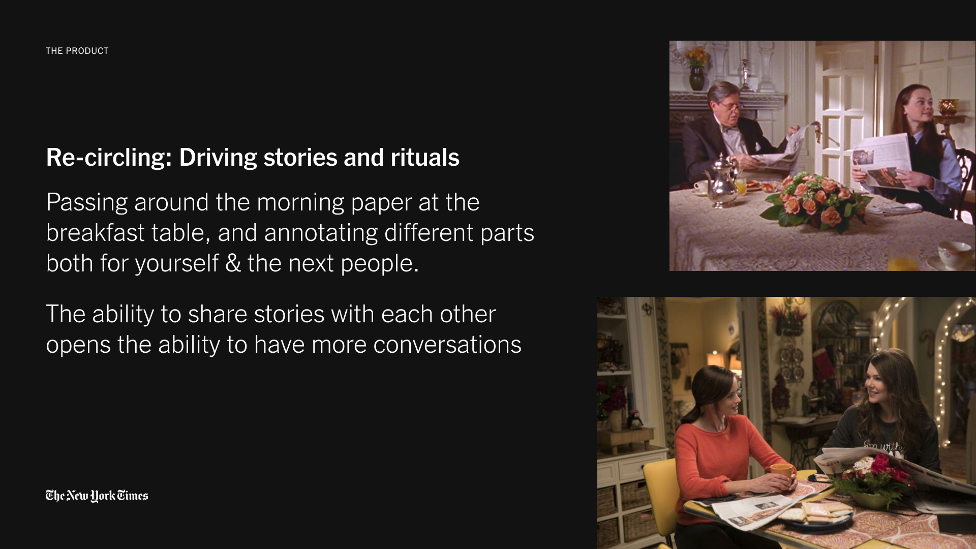
Looking back at the interactions afforded by the rituals of physical papers, we can provoke that the news was never meant to be experienced alone. Rather, it was meant to be marked up, passed around, and talked about — metaphors I took to design an interface with.


Final Design
We wanted a design that danced between delightful and non-disruptive, and therefore really focused on the visual details and carefully adding dynamic movement for a sense of polish.