Departing Note — designing spaces for leaving
Senior Design Research Studio
6 weeks
6 weeks
Collaborators
Yash Mittal
Yash Mittal
Role
Designer, Technologist
Designer, Technologist
Problem + Design Opportunity
We began our research by analyzing the current airport travel experience, through personal and secondary experiences, media, and literature review.
I recounted the scene where Ross chases after Rachel up to the gate to profess his love. This juxtaposes how air travel is portrayed in newer media, where security is stricter and travelers are separated at security lines or even the drop off. In contrast to the Friends episode, I recounted the scene in Ladybird where Ladybird is getting dropped off at the airport with her parents to go to college for the first time; however, her mom is unhappy that Ladybird is choosing to study so far away, and in her grudge, proclaims that she’s just going to keep driving in circles around the airport as her dad helps her check in her bags. However, we see that she soon regrets her decision and parks and runs into the airport, only to be met by her husband and the reality that her daughter had already checked in.
Airports have become symbols for leaving and returning — and with that, comes big feelings.
Approach
We were particularly interested in the rituals of traveling by flight, and how they reflect on our human experience & emotions surrounding “leaving”.
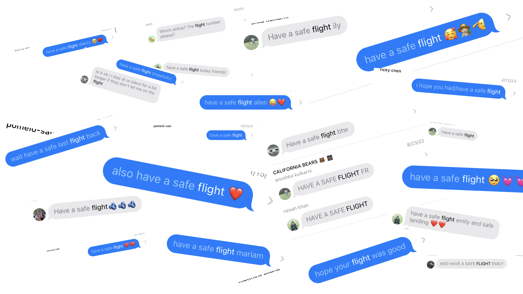
Early on in the departure experience, solo travelers are subject to passing time in an in-between space, dedicated to “leaving”.
However...
Leaving is hard. And in a world where air travel often means being completely alone after that first step into the security line, leaving gets really emotional. Therefore, we reached the question:
How might we design an airport experience where connection sustains throughout the whole departure journey?
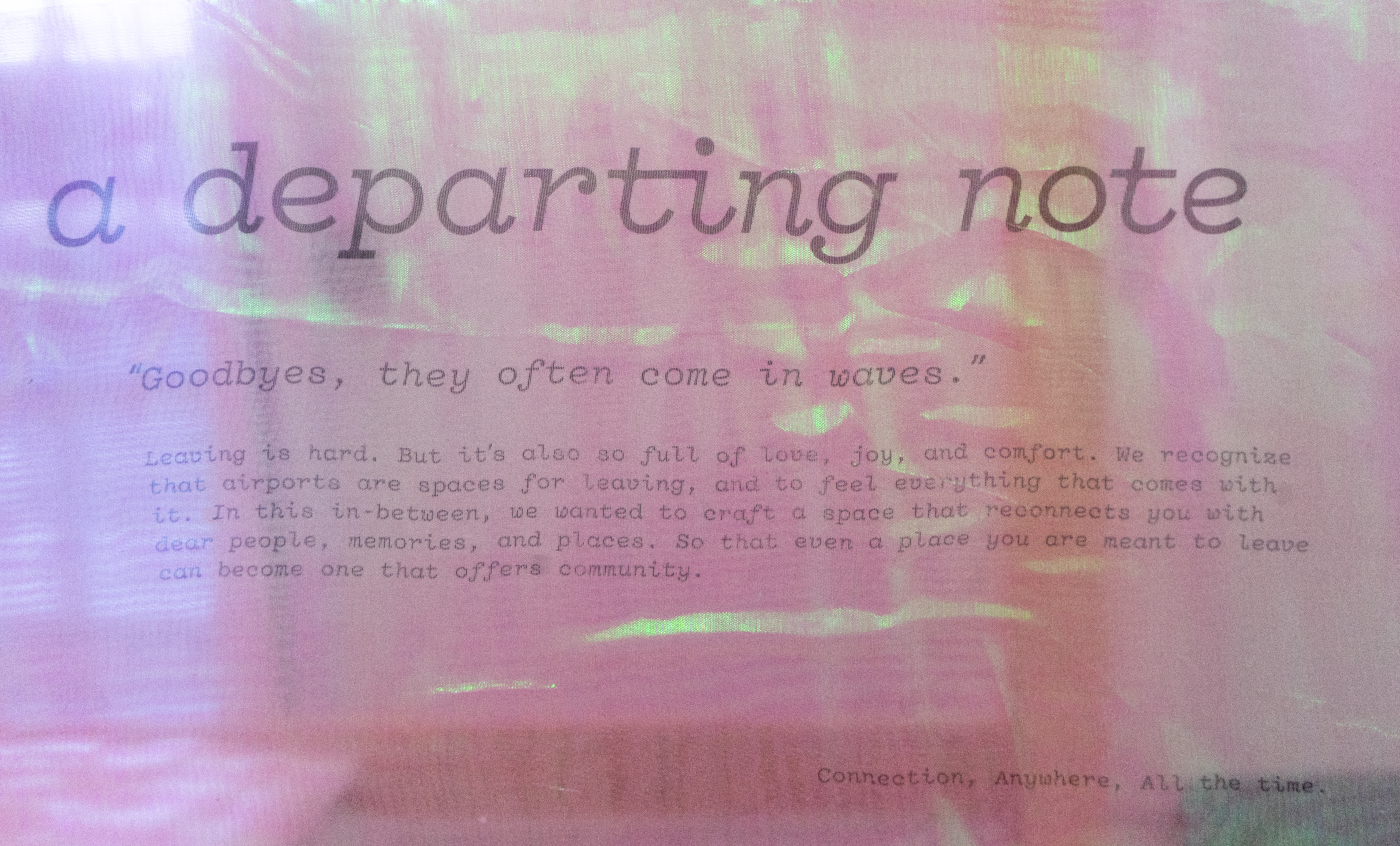
A Departing Note
a service to leave a surprise message for your travelers, then accessed at their gate
We envision a future where our service is a ritual in the air travel experience. Loved ones can go onto a website to create a note for travelers they know are taking off soon.
Our design consists of a form (for the sender) and booth experience (for the recipient).
Sender’s Experience
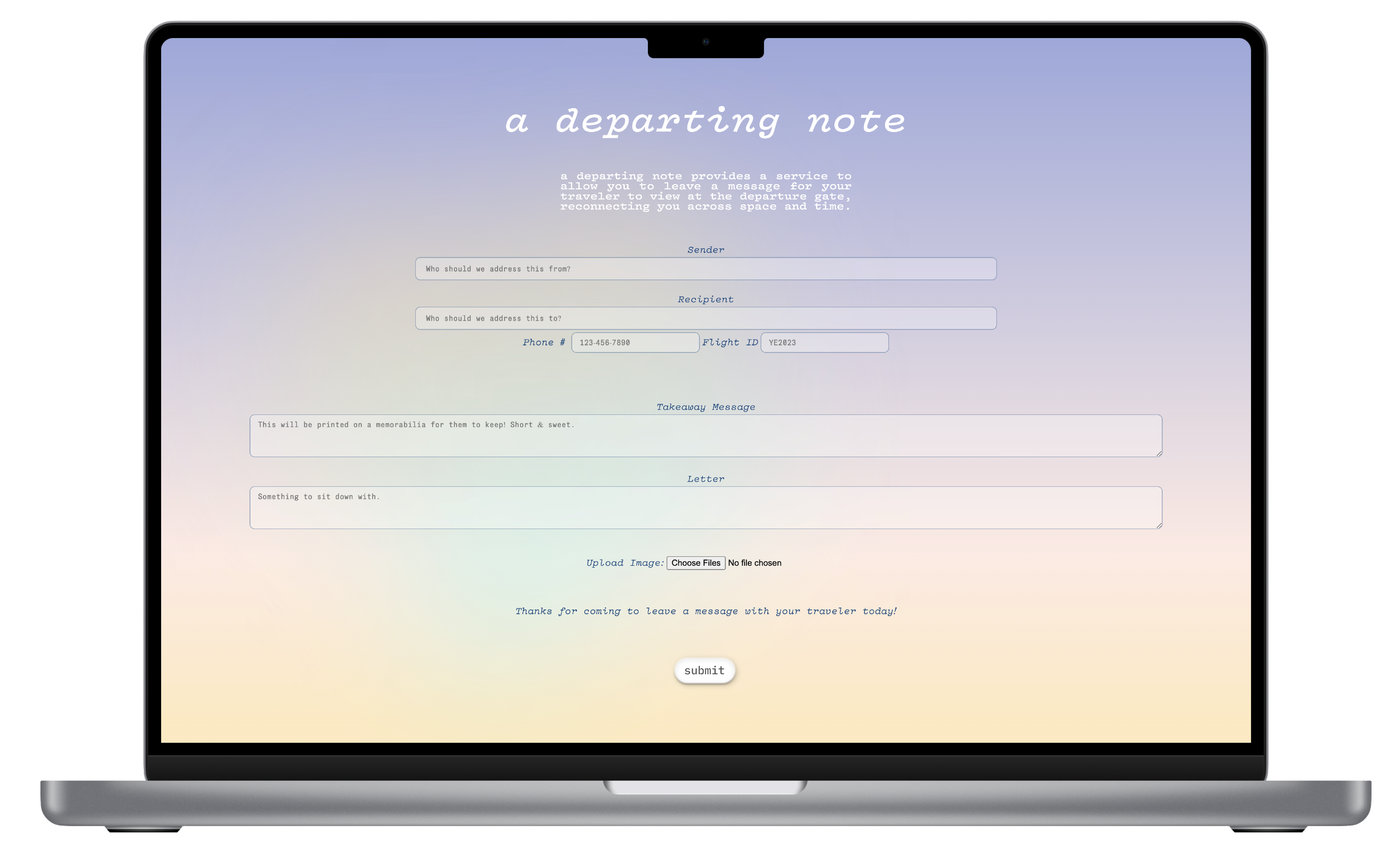
Recipient’s Experience
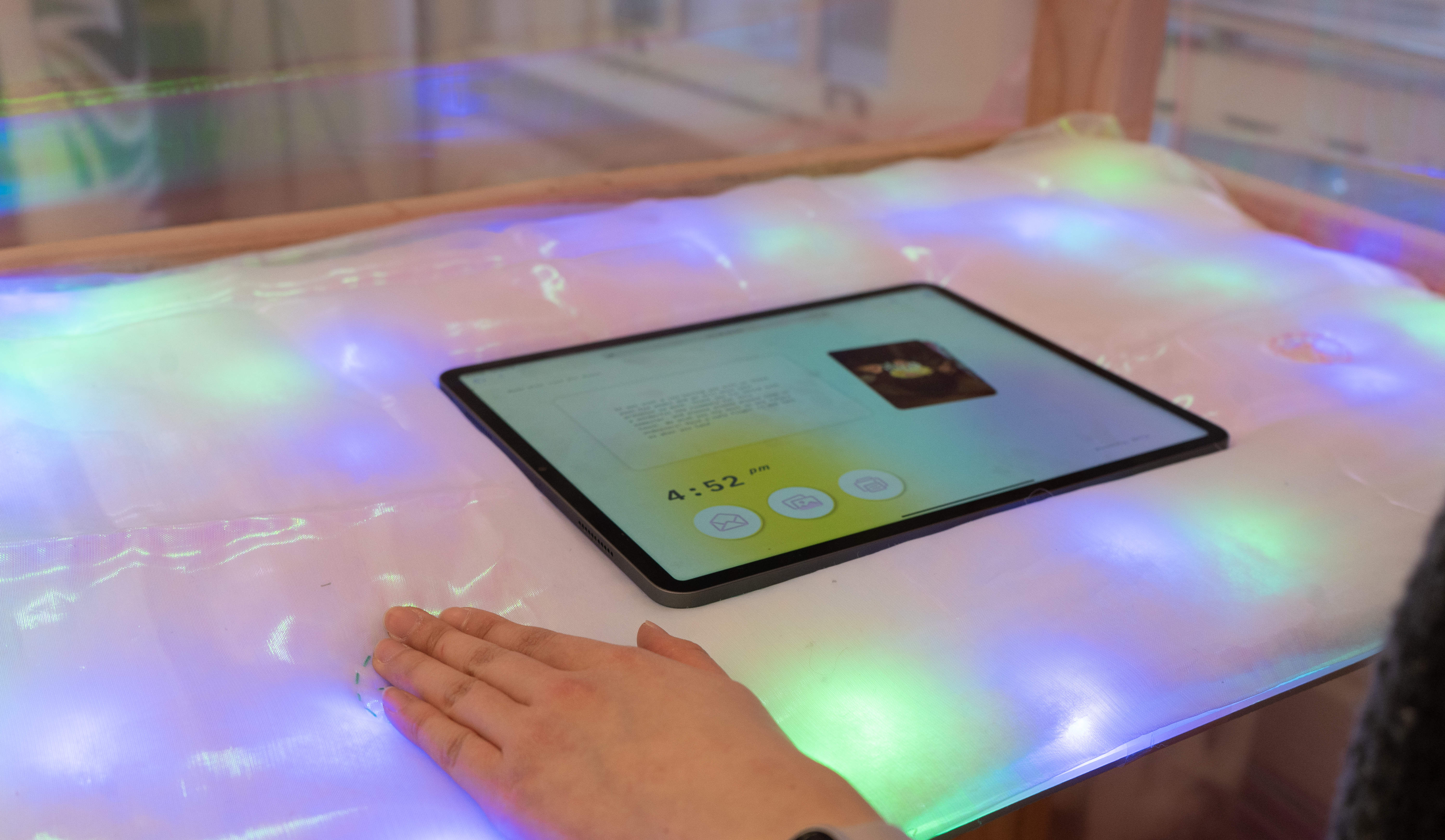
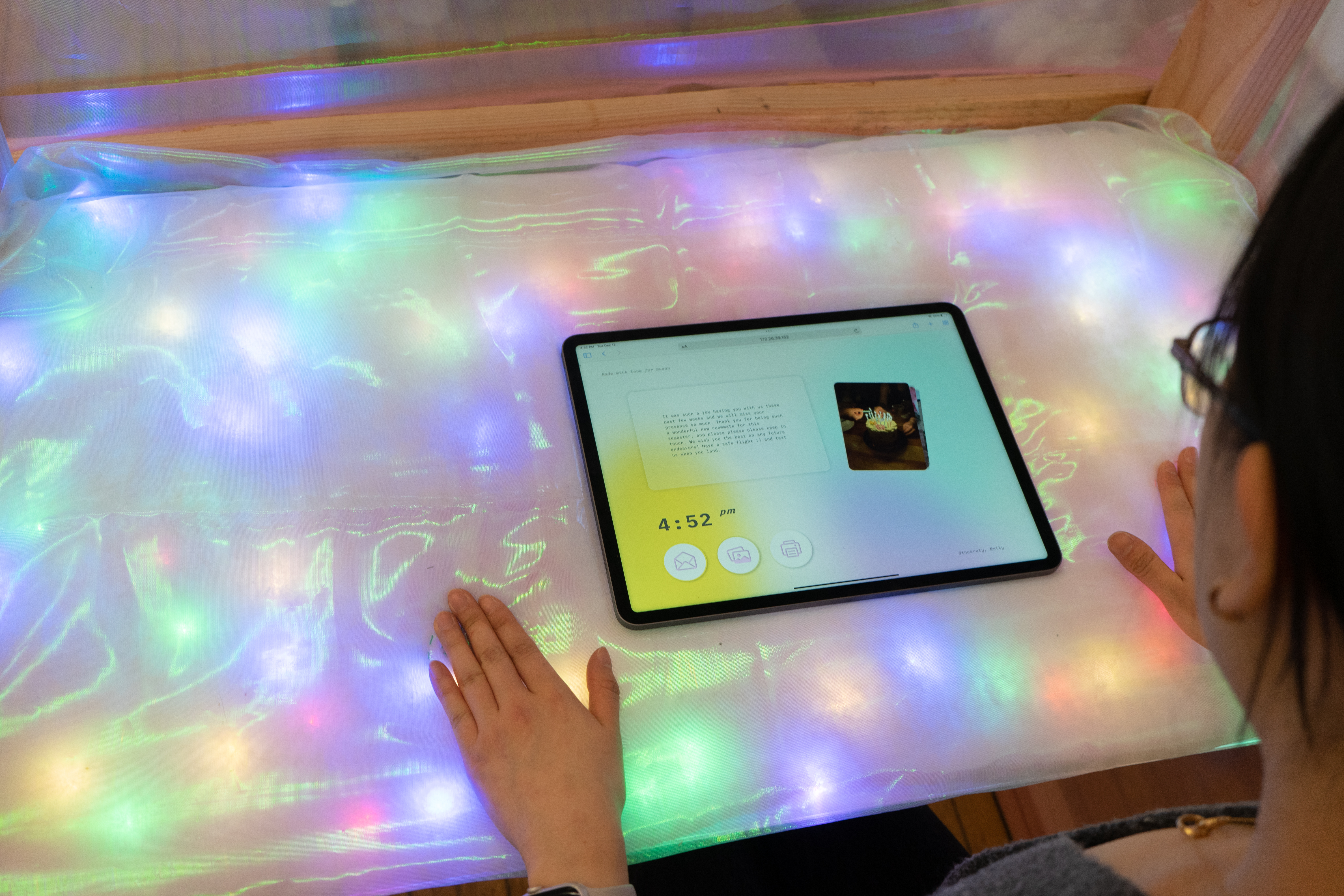
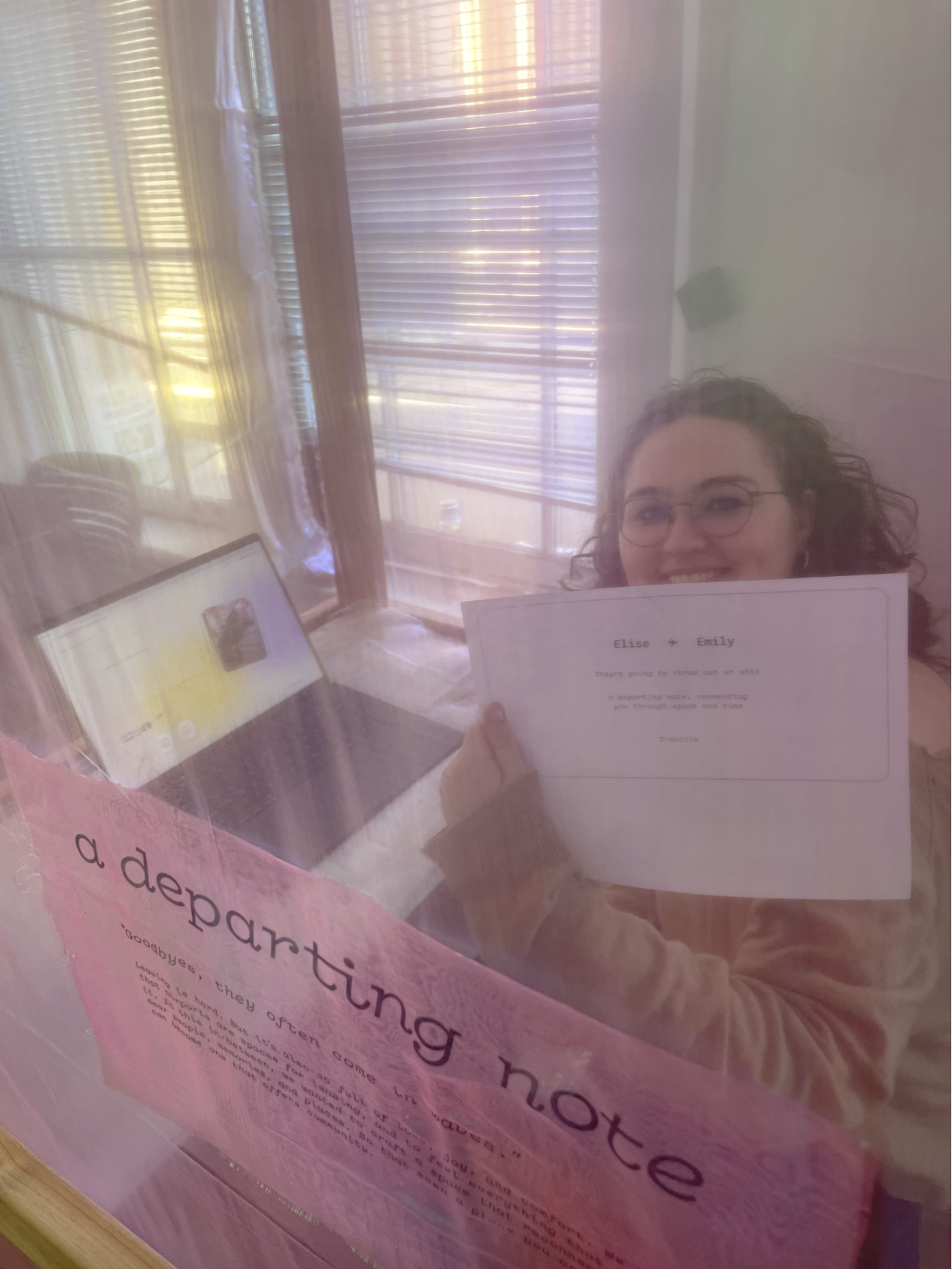
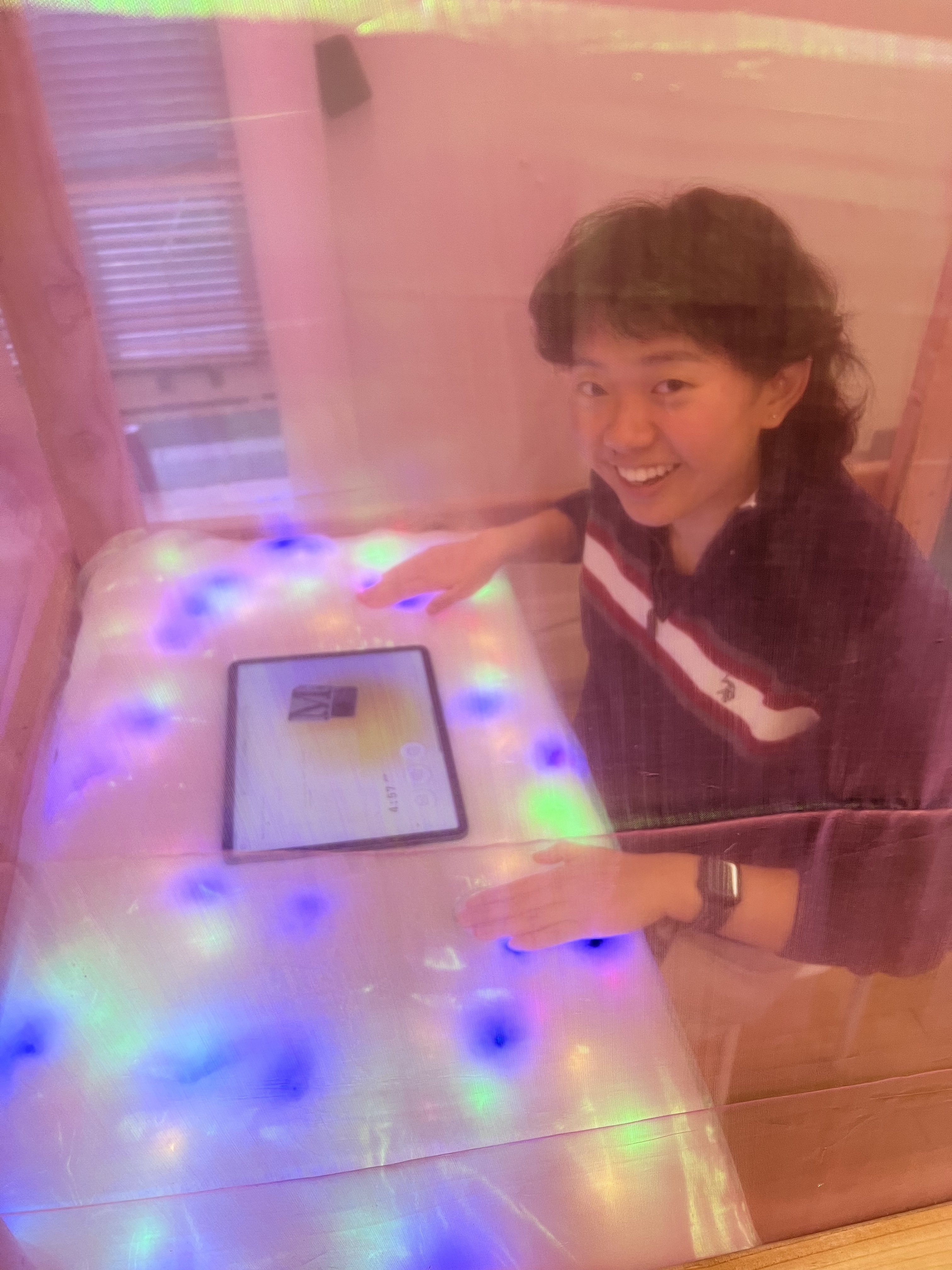
Recipients receive a notification on their phones to go receive their message at a certain booth at their gate. The booth experience was designed with materials that would create a balanced public and private experience. The dimensions are also wheelchair accessible.
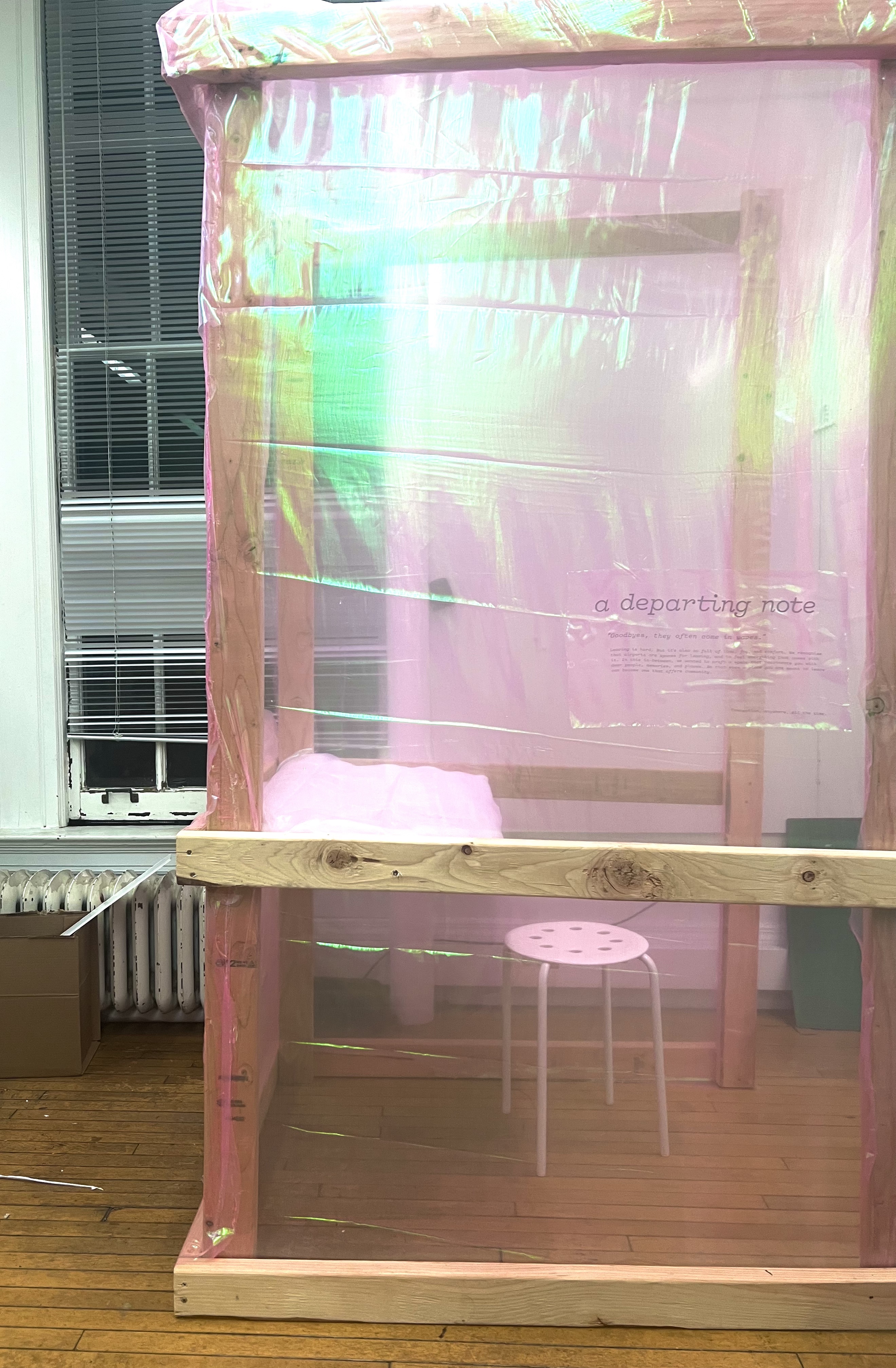
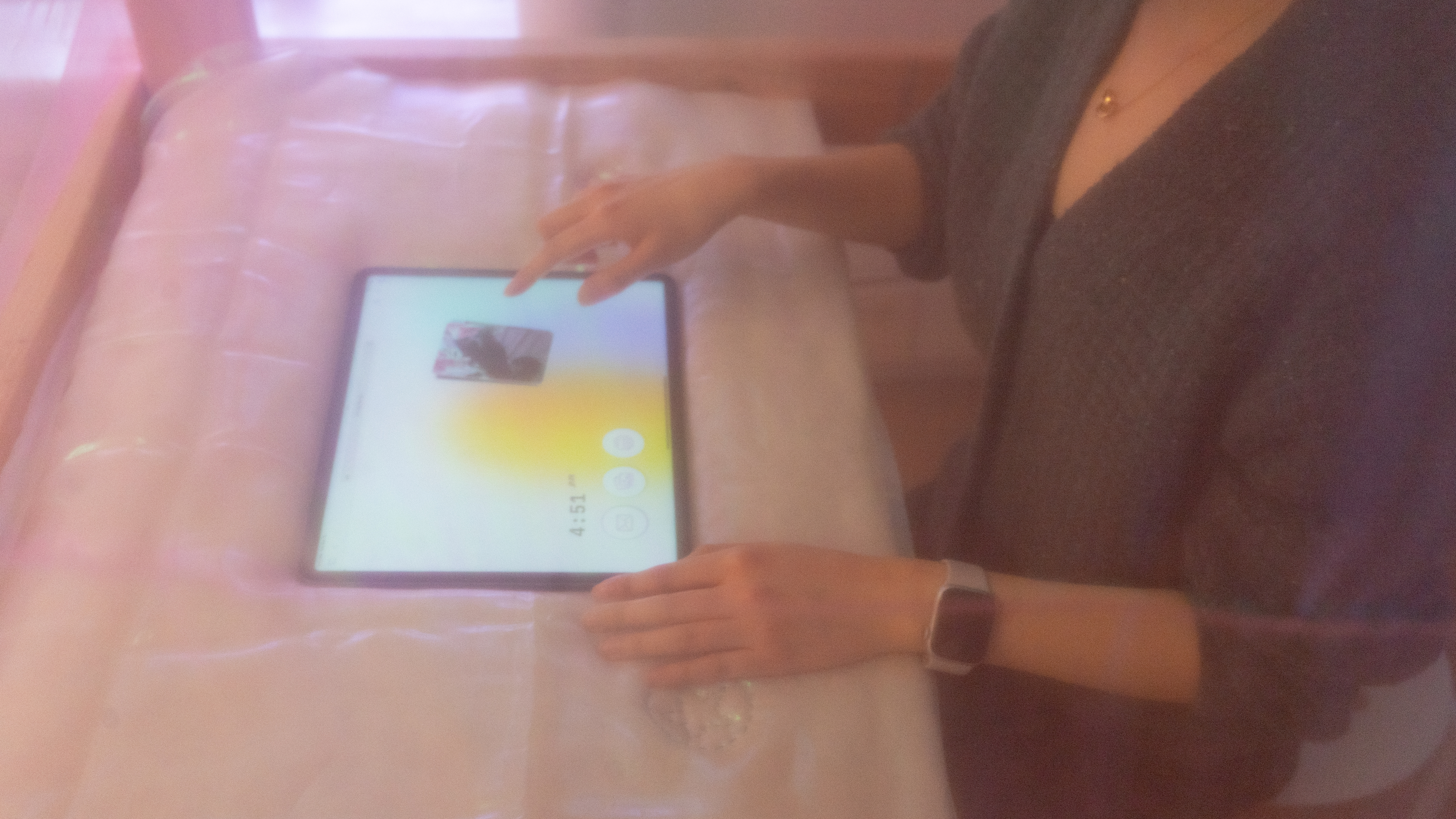
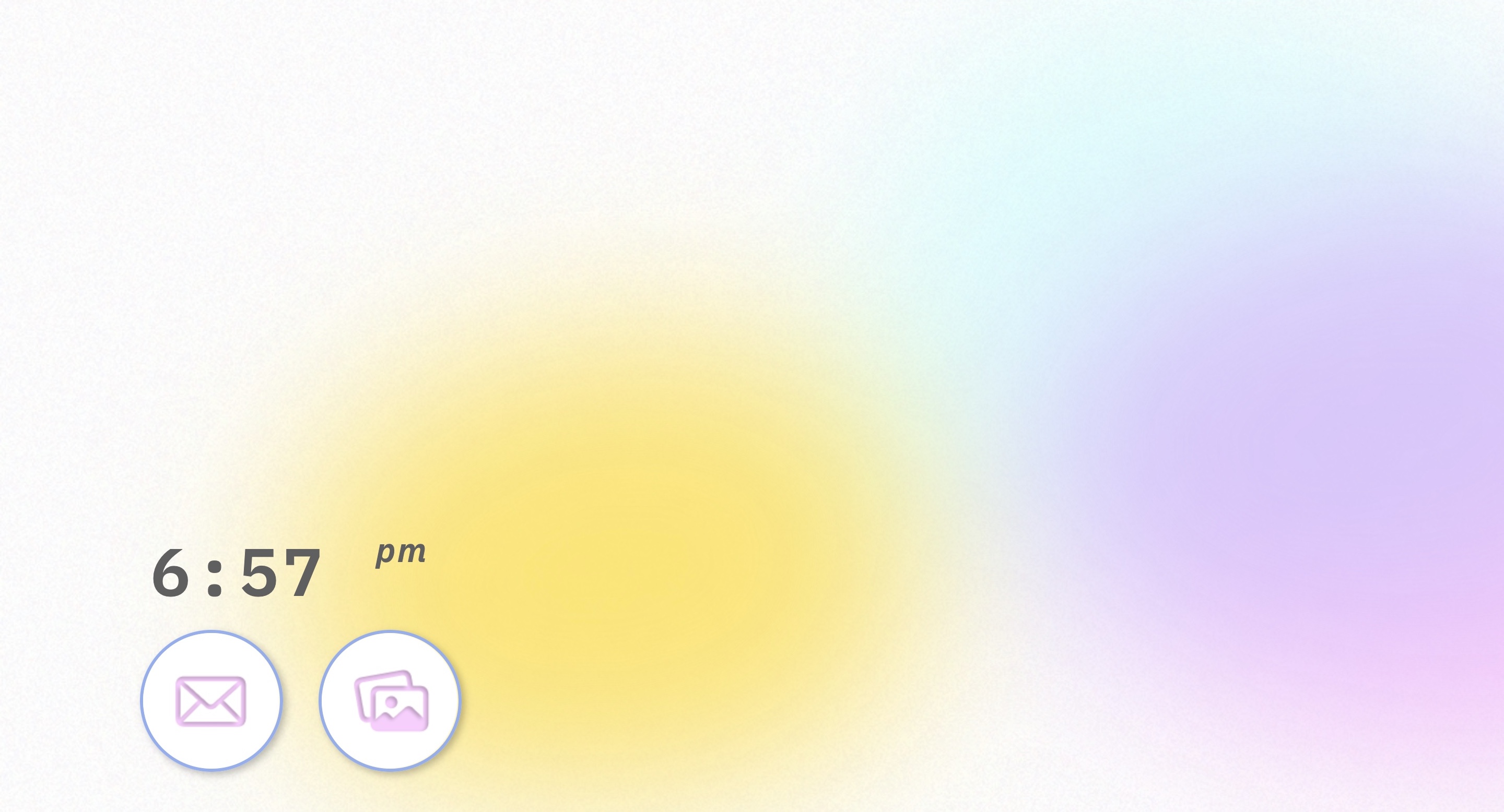
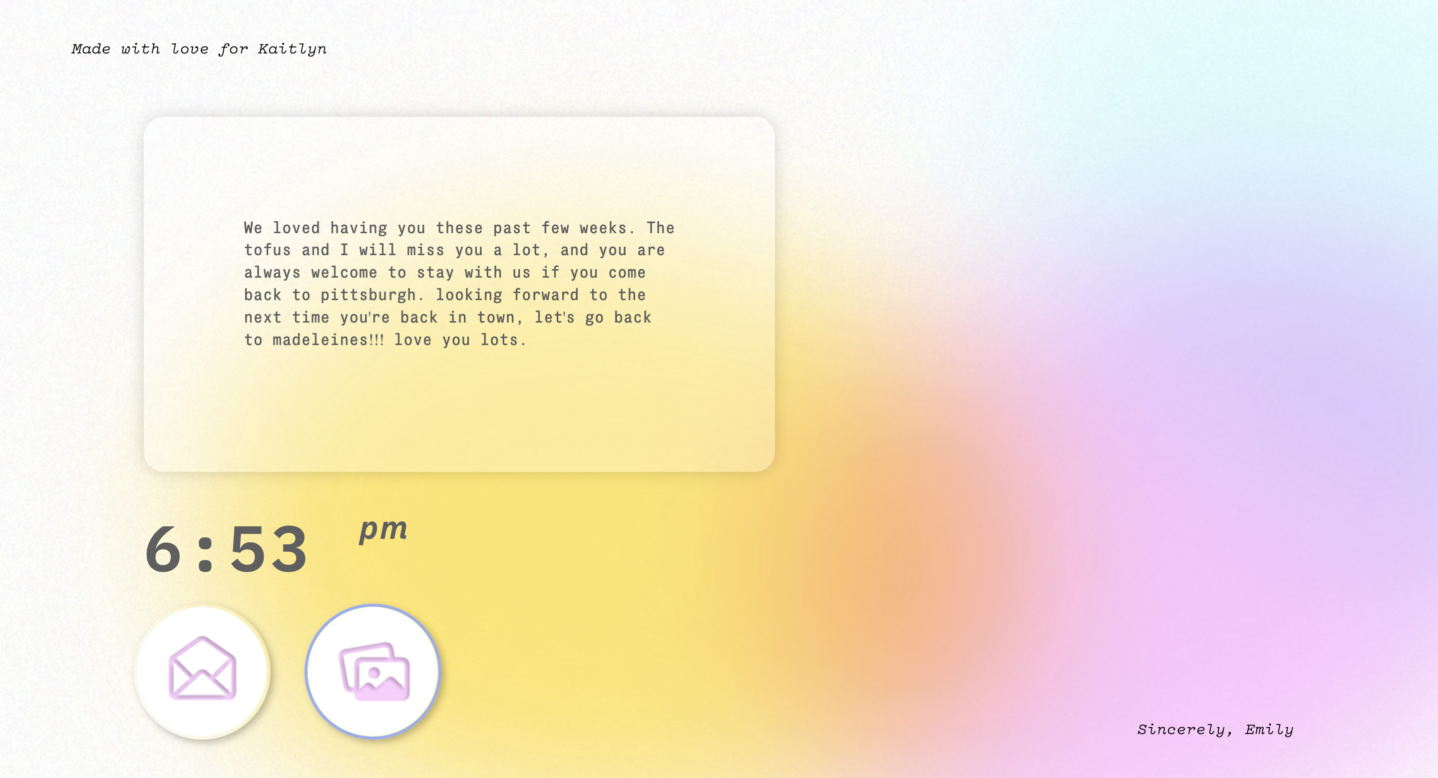
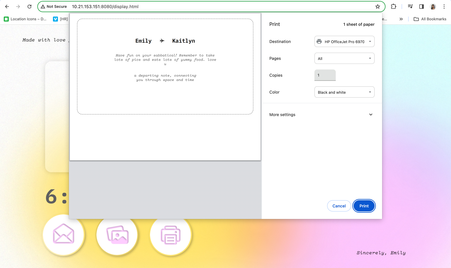
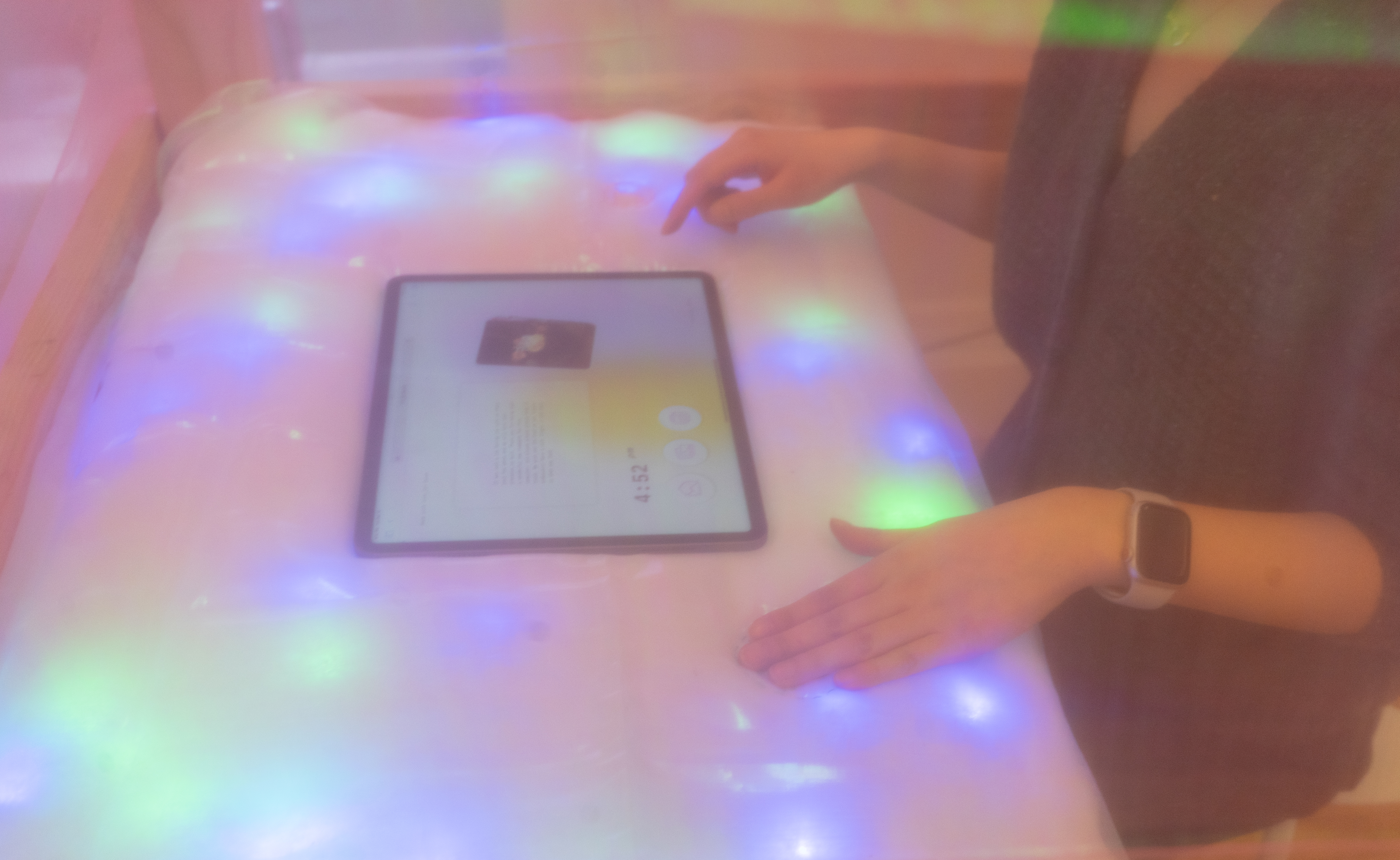
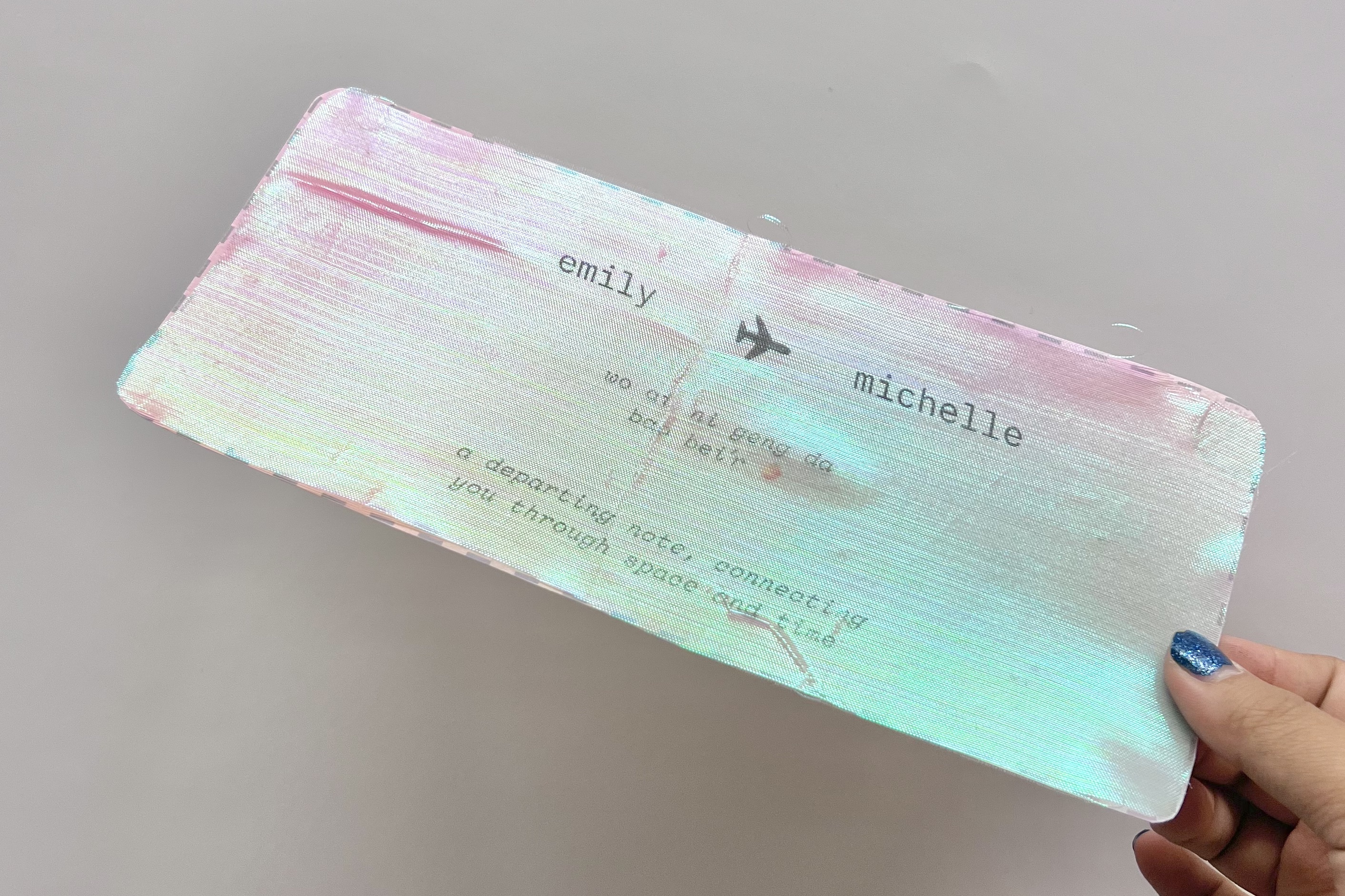
We designed a sitting experience so users can feel that they can take their time with their message. They are met with a screen embedded in a soft, interactive table. We wanted an experience that was comfortable and familiar, so the designs play off the joy of playing with simple buttons. The initial screen shows buttons that will bring up a written note as well as shuffled images. After they interacted with those two initial buttons, a new print option shows up, which allows them to print a message (the “short takeaway message” in the form).

There are also soft buttons on the table itself, to evoke senses of discovery and wonder. The digital experience extends beyond the screen, into the tangible.

Gallery


bloopers: with the ‘rents