Circles | a community-focused news consumption experience
GOAL
Design a new product for the NYT to increase engagement among young people with the news. Go blue-sky.
Design a new product for the NYT to increase engagement among young people with the news. Go blue-sky.
ABSTRACT
Younger people are reading the NYT for their news less and less. How/is this a reaction to our relationship with technology and how digital products are presented to us?
Younger people are reading the NYT for their news less and less. How/is this a reaction to our relationship with technology and how digital products are presented to us?
NYT Product Design Internship
Summer 2023
Summer 2023
duration
10 weeks, 3 hours each week
10 weeks, 3 hours each week
tools
Figma
Figma
role
designer, researcher
designer, researcher
The full, final slidedeck with in detail process and the product as a whole can be viewed here︎︎︎.
APPROACH
We began by really closely questioning and analyzing the relationships between younger generations, technology, and the news, to reach a few insights:
1. Younger people have an expectation for their digital experiences to be interactive, engaging, and centered around people and networks.
2. The news has a sentiment of being negatively emotionally overwhelming.
3. The news consumption experience online is mostly individual, from the experience of reading articles itself to the algorithms that recommend articles.
To which, a distinct conclusion was reached:
Younger generations mainly consume the news through the internet and within mobile phones, compared to older generations interacting with physical papers. What was lost in the transition between physical papers and the current NYT news app, and how we can we re-translate some of those lost interactions?
In response to these questions, we designed Circles, a community-centered app that’s used congruently to the current NYT news app. Circles allows you to annotate articles either for yourself, or in order to start conversations within them. Your circle’s activity shows up in a feed, recommending you media based on your community’s interests (vs. echo chambers). You also have your own profile which you can personally curate, as well as opportunities to browse, join, and/or make [other] communities.
Annotating
I designed the annotating tools for Circles, which allows you to select sentences of an article at a time, and comment, highlight, react, or share them.
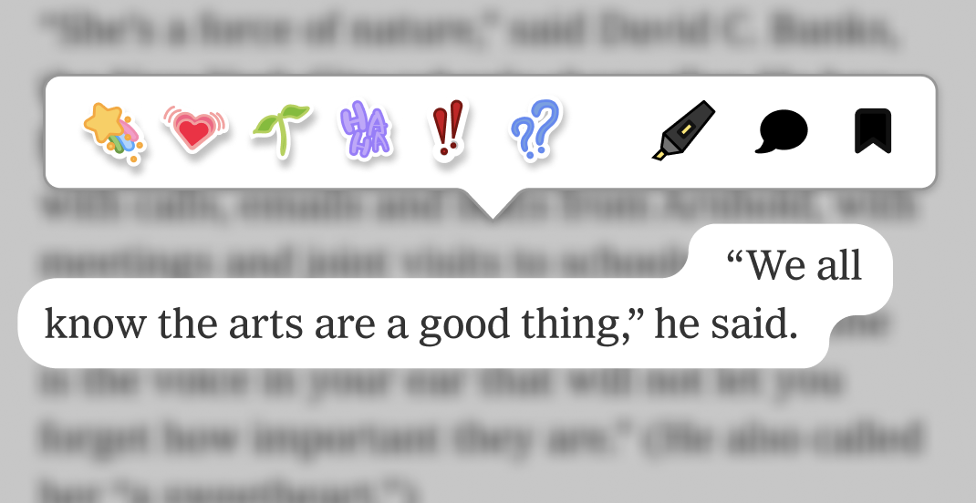
The design dug at a fundamental user goal we uncovered: that younger people ultimately just want to be able to hold more meaningful conversations with each other. In a digital world boasting an excess of information, it becomes increasingly difficult to find and focus on information of meaning. A community-oriented approach more fundamentally affords conversation.
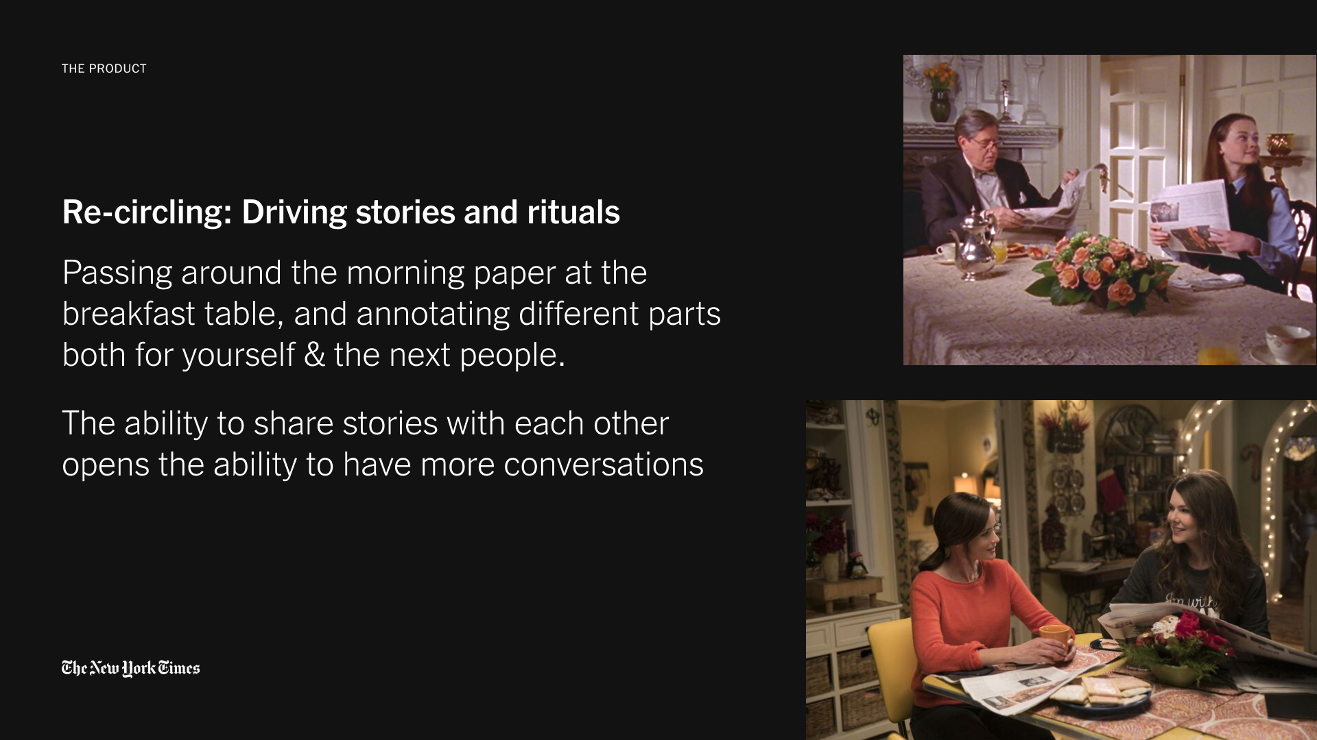
Looking back at the interactions afforded by the rituals of physical papers, we can provoke that the news was never meant to be experienced alone. Rather, it was meant to be marked up, passed around, and talked about — metaphors I took to design an interface with.

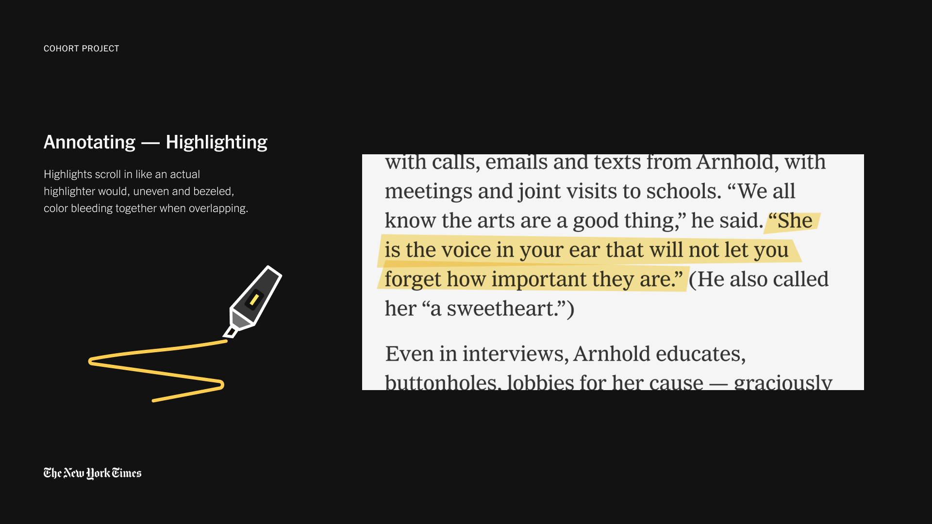


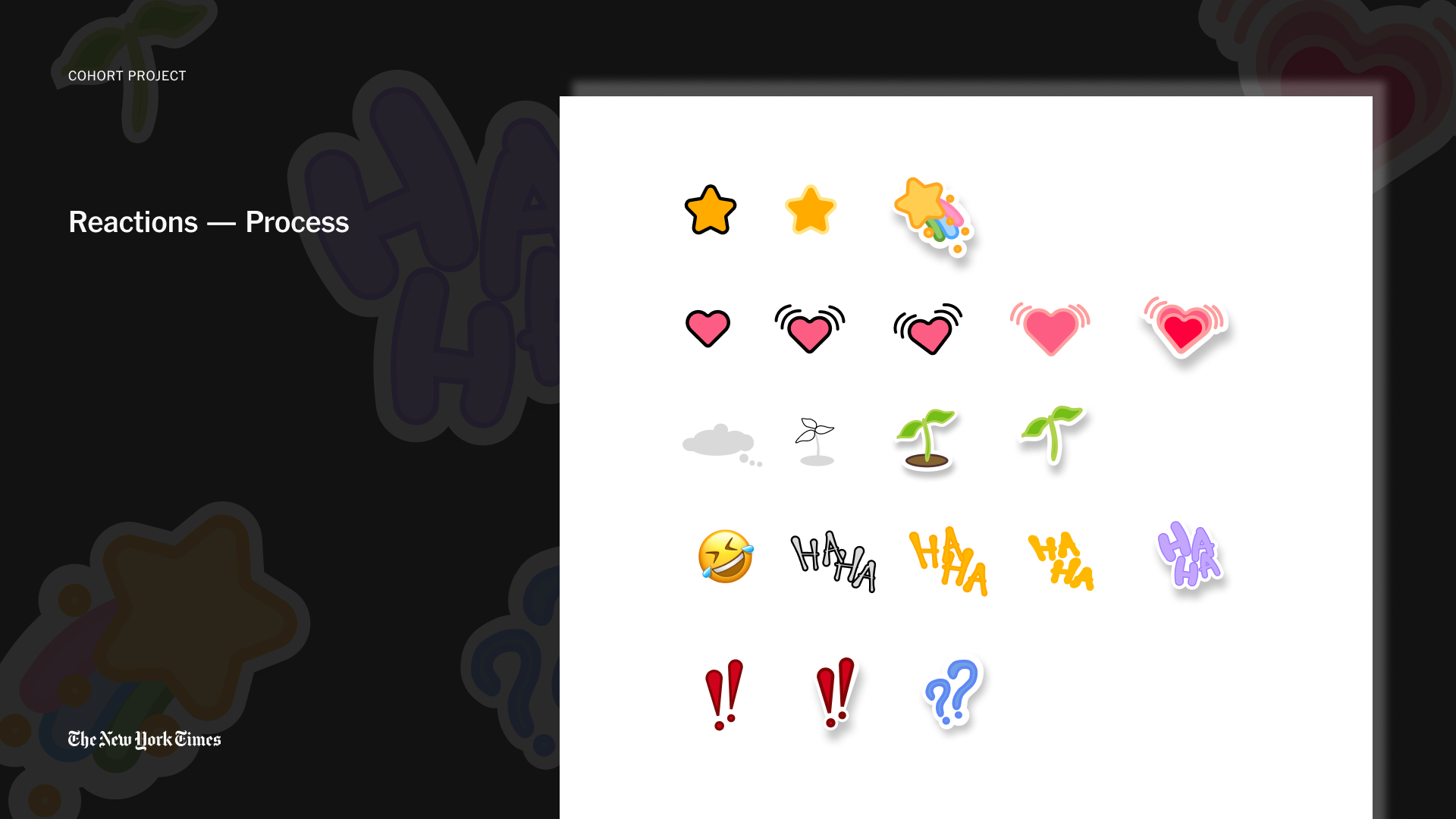 We wanted a design that danced between delightful and non-disruptive, and therefore really focused on the visual details and carefully adding dynamic movement for a sense of polish.
 PRODUCT IDENTITY: the name, Circles
Lastly, we participated in a naming workshop. Amongst many other strong reasons, the name Circles was landed upon for how it represented community and infinity, as well as for how it is a metaphor for that dining table setup where sections of the paper get passed around and discussed.